Buying Selling Volume v2Builds on Ceyhun's "Buying Selling Volume" indicator. This version allows users to define periods by effortlessly dragging two points or you may define periods by manually entering the start and end times in the settings window. Once the period is defined, both buying and selling volume will be totaled thus displaying the amount of buys and sells in that period.
I have found the information provided from the script helps in defining a period of consolidation as either being accumulative or distributive.
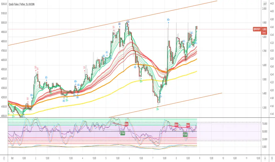
ค้นหาในสคริปต์สำหรับ "volume indicator"

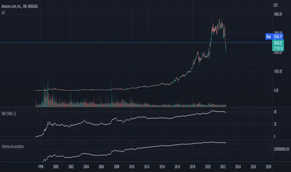
Chaikin Volume AccumulatorThe Volume Accumulator is used in technical analysis to identify strengths and weaknesses in a market. It is derived from the On Balance Volume indicator, except that instead of giving all the volume to bears on red days and bulls on green days it gives a proportional amount to both depending on the relative close price. As with many trading indicators, classic divergence between the VA and the close price may indicate an incoming reversal.
As a general rule of thumb:
Price Up:
VA up = clear uptrend
VA sideways = moderate uptrend
VA down = weak uptrend
Price Sideways:
VA up = accumulation
VA sideways = no bias
VA down = distribution
Price Down
VA up = weak downtrend
VA sideways = moderate downtrend
VA down = strong downtrend
Vwap SalvatierraVwap Salvatierra. an indicator that must be accompanied by other volume indicators.
Benefits:
- Long term Vwap.
- Middle Std. deviations, Calculated automatically.
- Previous zones available.
How to use:
when the price is >= stdev+3, look for shorts till came back to vwap
whe the price is <= stdev-3, look for longs till came back to vwap
if the vwap cannot be broken, as resistance, after several attempts, then sell
if the vwap can't be broken, like support, after several tries, then buy.

Price ActionFirst, you have to know price action, RTM price action Handbook could help you
this indicator shows you base and momentum candles
base candles could be zones of trade that show you fighting of bulls and bears, and momentum candles could show the power of those zones.
Base candles are white in the chart, and you can place your order at the good zone.
Rally candles and drop candles are momentum candles, and bold rally and bold drop show that it is more powerful than its before candle.
Zigzag compression is one way that shows the compression in trend.
it looks like the Wedges pattern at classic technical that shows pending orders are closed, so the target zone could be powerful to reverse the trend.
Black background of candle means that candle doesn't reach its before candle and so it is poor candle, I named it domination.
It is better to do not trade at poor candles.
At the end, I find Price action the best way to trade, and it makes you free of other indicator, even volume indicator.
This indicator is good for those who use price action strategy to trade and those who want to learn the price action.
It could be so helpful and reliable way to find the zones, and place buy or sell order and the target, specially for scalping.
CT Reverse Chande Momentum OscillatorIntroducing the Caretakers Reverse Chande Momentum Oscillator.
The Chande momentum oscillator is a technical momentum indicator which calculates the difference between the sum of recent gains and the sum of recent losses and then divides the result by the sum of all price movement over the same period.
It is used to gauge “pure momentum”.
It bears similarities to other momentum indicators such as the Stochastic, Rate of Change and the Relative Strength Index, but other unique features render it a handy tool in the traders handset.
The CMO was developed by Tushar Chande.
The author introduced the indicator in his 1994 book “The New Technical Trader “.
The CMO has a normal range of values between +100 and -100.
I have reverse engineered the CMO formula to derive a dual purpose function.
The function can calculate the chart price at which the CMO will reach a particular CMO scale value.
The function can also calculate the chart price at which the CMO will equal its previous value.
I have employed this function here to give the price level where the CMO will equal :
Upper alert level ( default 50 )
Zero-Line
Lower alert level ( default -50 )
Previous CMO value
These crossover levels are displayed via an optional infobox with choice of user selected info.
The advantage of knowing the exact prices that this will happen should give the user an additional edge and precision in risk management.
Traditionally traders and analysts will consider:
Positives values above 50 indicate an “overbought” condition
Negative values below -50 indicate an “oversold” condition
Common traditional ways to derive signals from the CMO :
When the CMO crosses above the zeroline, a buy signal is generated.
When the CMO crosses below the zeroline, a sell signal is generated.
When the SMI crosses below -50 and then moves back above it, a buy signal is generated.
When the SMI crosses above +50 and then moves back below it, a sell signal is generated.
Traditionally, traders also look for divergences between the CMO and price action.
Chande Momentum oscillating in a narrower band around the zero line, with no penetration of the Overbought and Oversold levels indicates a ranging market.
This should not be confused with Chande Momentum oscillating between either the Overbought and the zero line, or the Oversold level and the zero line, which indicates a strong up, or down-trend.
It is traditionally considered that the strongest trend signals are from failed swing patterns.
It measures momentum on both up and down days and does not smooth results, triggering more frequent oversold and overbought penetrations.
The CMO is often used to determine overall market trendiness in conjunction with the SMI where the SMI is used to determine the direction of the trend, and also with volume indicators to show if the momentum carries significant selling or buying pressure.

Rolling Cumulative VolumeThis indicator show a simple rolling cumulative volume. A field is specified. Then all last volume indicators are summed.
For example it could calculate last 24h Volume if you use the 1h bars and set the length for 24.
Improved On balance volume with BB channel and double MAThis is an improved version of the on balance volume indicator.
I made it inside a bollinger band channel, so we can define better the zones. At the same time I applied 2 moving averages on OBV, to get a better idea of the trend and at same time that change direction of the trend.
Green - > uptrend - > we look for buy positions
Red - > downtrend -> we look for sell positions.
At the same time we have to be aware of crosses on bollinger bands, which can indicate a change in the trend .

Normalized Accumulation/Distribution OscillatorThis is the oscillator version of the Accumulation/Distribution volume indicator. The oscillator is normalized by n-period volume moving sum. The value oscillates between 1 and -1. One way to use this oscillator is to identify the divergence between price and oscillator reading in trending market, and to spot potential reversal.

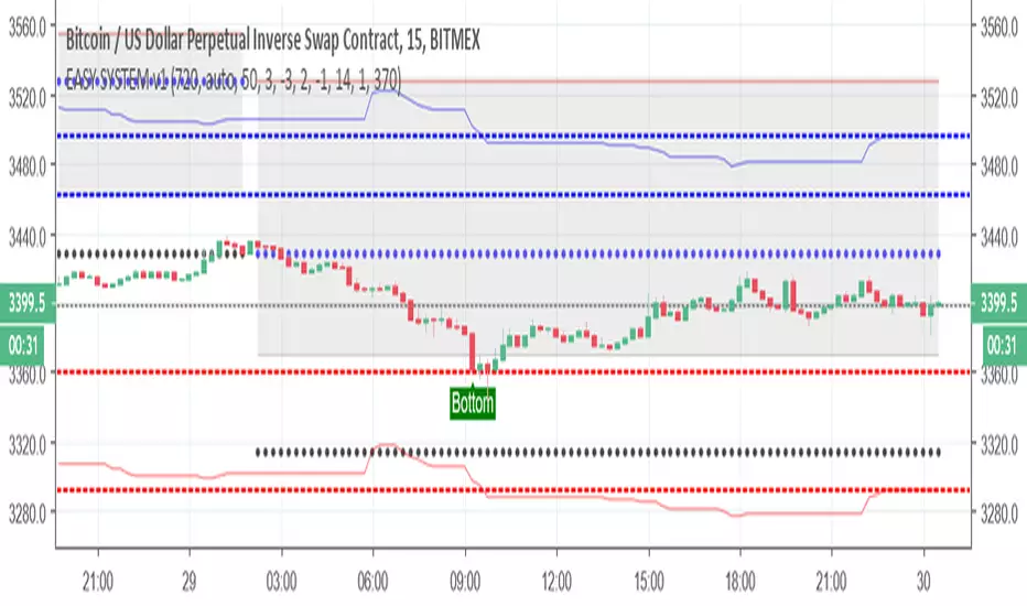
EASY SYSTEM v1So here I try to make the easy system better using different scripts
I keep the donchian % channel from easy first version --this good for setting your take profit or your stop loss use it wisely
I add the top and bottom finder - here I advise to use also another indicator to verify the spots , the last one always be the bottom but in dump it will show few bottom until it find the true bottom
I add bullish area zone and bearish area zone with colors which is optional if you want to see the trend that you are now
add pivot system with MTF for also helping to see the tops and the bottom
I suggest you to add linear channel of 200 length on top it so it will be more easy to see where the asset is going
Also see the volumes (I have many volumes indicators or any volume indicator of your choice
your Aim is to buy the lowest - and sell the highest so patience sometime can save you allot of money
most of mistakes is because we want to win and we enter either too early or too late .
Colored Volume Bars All Markets: Combining Volume SourcesUsing volume in Forex is potentially misleading as we are only provided the broker volume or futures exchange volume for the currency or commodity in a decentralised market. This code combines the volumes from FXCM, Onanda and futures for the instrument being studied. The combination of the volumes could improve the reliability of the volume being considered. Using this approach other volume indicators can also be improved.

Simple TrenderOriginates from:
I was reading some Impulse Trading literature by A. Elder.. In it, someone named Kerry Lovvorn proposed "An End of Day Trend Following System" for someone lazy.
Originally it is just price closing above an 8 ema (low) for long. Exit when price closes below an 8 ema (low). The opposite for a short position.
Conditions: Buy when price closed below ema (low) for two bars or more, then closes above. Opposite for a short position. I do not follow this condition. Though it may help with whipsaw.
My condition is when price closes above the 26 ema (low) (works the best for me) I place orders above the initial crossing bars high. Opposite for lows.
I look for stocks that are low in price to go long on. I want the run from 2's to 15's
I look for stocks that are mid-teens/20's in price to go short on. I want the run from 20's to 2's
I look for stock with news and earnings that are already running (up or down) to play the pullback.
These conditions can easily be scanned for on thinkorswim
From first glance, the system looks like CMsling shotsystem. Although, I plagiarized some parts of the codes, because I am inept when it comes to that shit, it differs as it is not a moving average crossover system.
It is a price crossing over concept. A moving average VWAP is used for best entries on pullbacks.
Purpose:
--To catch the majority of a trend/wave/run.
--To identify pullback areas to go long or short while in midst of trend. To catch pullbacks off news and earning runners.
--To catch the initial start of trend with clear rules to enter
--Clear rules to exit
Issues
--possibilities of getting ninja sliced the fuck up. Can be mitigated by entering stocks with decent average volume. And also only going long above 200 ema and short below it. ADX won't work, at the initial start of the trend it will show not trending. Can look at blow off volume at the bottom followed by increase in buying for long and vice versa for short.
--Can give some huge gains away through gap ups or gap downs from news or earnings during trend. However, can get huge gain on gaps from news or earning. Nature of the game.
--Need some brass balls and a supply of pepto to stomach through some of the pullbacks. Gut wrenching seeing big gains dwindle. But they all even out at the end, you hope. (see NBEV and IGC, and CRON and others. shit don't go in straight lines, homie)
Pros
--It's simple and easy. Overall, you profit
--works with any security
Cons
--It can be stressful.
--does not work well on lower time frames. Do not recommend going below 15 minutes
--Possibility of working on 5 minutes with a time frame breakout strategy (15,30 min).
Couple it with LazyBear "Weis Wave Volume" indicator. Works well for pullback entries.
Enjoy. Ride some waves.

BlackCompositIndicator4OverlayThis is not new indicator.
// Candle Patterns Indicator created by Robert N. 030715
// Volume Indicator @author LazyBear
// Updated and translated by Blyayshman
Это не новый индикатор - это компиляция нескольких для удобства одновременного отображения и экономии разрешенных индикаторов.
Эта версия для отображения на главном экране, вместе с графиком.
Можно отобразить до 4-х MA, 2-х EMA и анализатор паттернов японских свечей.
Пожелания и предложения приветствуются.
Hersheys Volume Pressure v1Hersheys Volume Pressure gives you very nice confirmation of trend starts and stops using volume and price.
For up bars...
If you have a large price range with low volume, that's very bullish.
If you have a small price range with low volume, that's bullish.
For down bars...
If you have a large price range with low volume, that's very bearish.
If you have a small price range with low volume, that's bearish.
Look at the chart and you'll see how trends start and end with a PINCH and widen in the middle of the moves.
Hersheys Volume Pressure is unique, in that it measures bull/bear pressure on each bar by itself. Other volume indicators like On Balnce Volume and Price Volume Trend use cumulative differences in the current and previous bar to show trends.
You can set the moving average period, 14 is the default.
Good trading!
Brian Hershey
MoBo Bands - Momentum Breakout IndicatorDESCRIPTION
MoBo Bands (Momentum Breakout Bands) is a volatility-based breakout detection indicator that helps traders identify potential momentum shifts in the market. The indicator uses dynamic bands calculated from standard deviation to signal when price breaks above or below established ranges, indicating potential bullish or bearish momentum changes.
═════════════════════════════════════════════════════════════
KEY FEATURES
═════════════════════════════════════════════════════════════
- Dynamic upper and lower bands based on standard deviation
- Color-coded bands that change based on breakout direction (green for bullish, red for bearish)
- Visual breakout arrows marking entry points above/below bands
- Optional colored fill zones between bands showing current momentum state
- Customizable displacement for band projection
- Built-in alert system for breakout and breakdown signals
═════════════════════════════════════════════════════════════
HOW IT WORKS
═════════════════════════════════════════════════════════════
The indicator calculates a middle line using a Simple Moving Average (SMA) with upper and lower bands positioned using standard deviation multipliers. When price closes above the upper band, a bullish breakout (green) is signaled. When price closes below the lower band, a bearish breakdown (red) is signaled. The bands and fill zones remain colored until the opposite signal occurs, providing clear visual confirmation of the current momentum state.
═════════════════════════════════════════════════════════════
CUSTOMIZABLE INPUTS
═════════════════════════════════════════════════════════════
CALCULATION PARAMETERS:
- Price Source - Select which price data to use (default: close)
- Length - Period for SMA and standard deviation calculation (default: 10)
- Num Dev Up - Standard deviation multiplier for upper band (default: 0.8)
- Num Dev Down - Standard deviation multiplier for lower band (default: -0.8)
- Displace - Shift bands forward for projection analysis (default: 0)
DISPLAY OPTIONS:
- Colored Mobo - Enable/disable color-coded bands
- Colored Fill - Enable/disable fill zones between bands
- Break Arrows - Show/hide breakout and breakdown arrows
ALERT OPTIONS:
- Show Alerts - Enable/disable alert conditions
═════════════════════════════════════════════════════════════
USAGE GUIDE
═════════════════════════════════════════════════════════════
Watch for price to close outside the bands as potential breakout signals:
BULLISH BREAKOUT: Green arrow appears below the lower band when price closes above the upper band, indicating upward momentum shift.
BEARISH BREAKDOWN: Red arrow appears above the upper band when price closes below the lower band, indicating downward momentum shift.
The bands also serve as dynamic support and resistance levels. When bands are green, momentum is bullish. When bands are red, momentum is bearish.
═════════════════════════════════════════════════════════════
BEST PRACTICES
═════════════════════════════════════════════════════════════
- This indicator works well on liquid futures contracts (MNQ, MES, MYM, MGC, MCL) and major
currency pairs across multiple timeframes
- Lower deviation values (0.5-1.0) produce more frequent signals suitable for scalping
- Higher deviation values (1.5-2.5) filter for stronger breakouts ideal for swing trading
- Combine with volume indicators for additional confirmation
- Use with momentum oscillators to validate breakout strength
- Best results in trending market conditions
- Consider the overall market context and trend direction
════════════════════════════════════════════════════════════
ALERT CONFIGURATION
═════════════════════════════════════════════════════════════
Configure custom alerts for automated notifications:
- "MoBo BreakOUT" - Triggers on bullish breakout signals
- "MoBo BreakDOWN" - Triggers on bearish breakdown signals
Set alerts to "Once Per Bar Close" for confirmed signals and avoid false triggers during bar development.
═════════════════════════════════════════════════════════════
IDEAL FOR
═════════════════════════════════════════════════════════════
- Day traders and scalpers on futures markets
- Swing traders looking for momentum shifts
- Breakout trading strategies
- Trend following systems
- Works on stocks, forex, crypto, and commodities
- Effective across multiple timeframes (1min to daily)
═════════════════════════════════════════════════════════════
Perfect for traders seeking clear visual breakout signals with minimal lag. The color-coded system and arrow markers make it easy to identify momentum changes at a glance.
© 2024 NPR21 | Mozilla Public License 2.0
Open-source script
NPR21
Disclaimer
The information and publications are not meant to be, and do not constitute, financial, investment, trading, or other types of advice or recommendations supplied or endorsed by

Double Weighted Moving Average (DWMA)# DWMA: Double Weighted Moving Average
## Overview and Purpose
The Double Weighted Moving Average (DWMA) is a technical indicator that applies weighted averaging twice in sequence to create a smoother signal with enhanced noise reduction. Developed in the late 1990s as an evolution of traditional weighted moving averages, the DWMA was created by quantitative analysts seeking enhanced smoothing without the excessive lag typically associated with longer period averages. By applying a weighted moving average calculation to the results of an initial weighted moving average, DWMA achieves more effective filtering while preserving important trend characteristics.
## Core Concepts
* **Cascaded filtering:** DWMA applies weighted averaging twice in sequence for enhanced smoothing and superior noise reduction
* **Linear weighting:** Uses progressively increasing weights for more recent data in both calculation passes
* **Market application:** Particularly effective for trend following strategies where noise reduction is prioritized over rapid signal response
* **Timeframe flexibility:** Works across multiple timeframes but particularly valuable on daily and weekly charts for identifying significant trends
The core innovation of DWMA is its two-stage approach that creates more effective noise filtering while minimizing the additional lag typically associated with longer-period or higher-order filters. This sequential processing creates a more refined output that balances noise reduction and signal preservation better than simply increasing the length of a standard weighted moving average.
## Common Settings and Parameters
| Parameter | Default | Function | When to Adjust |
|-----------|---------|----------|---------------|
| Length | 14 | Controls the lookback period for both WMA calculations | Increase for smoother signals in volatile markets, decrease for more responsiveness |
| Source | close | Price data used for calculation | Consider using hlc3 for a more balanced price representation |
**Pro Tip:** For trend following, use a length of 10-14 with DWMA instead of a single WMA with double the period - this provides better smoothing with less lag than simply increasing the period of a standard WMA.
## Calculation and Mathematical Foundation
**Simplified explanation:**
DWMA first calculates a weighted moving average where recent prices have more importance than older prices. Then, it applies the same weighted calculation again to the results of the first calculation, creating a smoother line that reduces market noise more effectively.
**Technical formula:**
```
DWMA is calculated by applying WMA twice:
1. First WMA calculation:
WMA₁ = (P₁ × w₁ + P₂ × w₂ + ... + Pₙ × wₙ) / (w₁ + w₂ + ... + wₙ)
2. Second WMA calculation applied to WMA₁:
DWMA = (WMA₁₁ × w₁ + WMA₁₂ × w₂ + ... + WMA₁ₙ × wₙ) / (w₁ + w₂ + ... + wₙ)
```
Where:
- Linear weights: most recent value has weight = n, second most recent has weight = n-1, etc.
- n is the period length
- Sum of weights = n(n+1)/2
**O(1) Optimization - Inline Dual WMA Architecture:**
This implementation uses an advanced O(1) algorithm with two complete inline WMA calculations. Each WMA uses the dual running sums technique:
1. **First WMA (source → wma1)**:
- Maintains buffer1, sum1, weighted_sum1
- Recurrence: `W₁_new = W₁_old - S₁_old + (n × P_new)`
- Cached denominator norm1 after warmup
2. **Second WMA (wma1 → dwma)**:
- Maintains buffer2, sum2, weighted_sum2
- Recurrence: `W₂_new = W₂_old - S₂_old + (n × WMA₁_new)`
- Cached denominator norm2 after warmup
**Implementation details:**
- Both WMAs fully integrated inline (no helper functions)
- Each maintains independent state: buffers, sums, counters, norms
- Both warm up independently from bar 1
- Performance: ~16 operations per bar regardless of period (vs ~10,000 for naive O(n²) implementation)
**Why inline architecture:**
Unlike helper functions, the inline approach makes all state variables and calculations visible in a single scope, eliminating function call overhead and making the dual-pass nature explicit. This is ideal for educational purposes and when debugging complex cascaded filters.
> 🔍 **Technical Note:** The dual-pass O(1) approach creates a filter that effectively increases smoothing without the quadratic increase in computational cost. Original O(n²) implementations required ~10,000 operations for period=100; this optimized version requires only ~16 operations, achieving a 625x speedup while maintaining exact mathematical equivalence.
## Interpretation Details
DWMA can be used in various trading strategies:
* **Trend identification:** The direction of DWMA indicates the prevailing trend
* **Signal generation:** Crossovers between price and DWMA generate trade signals, though they occur later than with single WMA
* **Support/resistance levels:** DWMA can act as dynamic support during uptrends and resistance during downtrends
* **Trend strength assessment:** Distance between price and DWMA can indicate trend strength
* **Noise filtering:** Using DWMA to filter noisy price data before applying other indicators
## Limitations and Considerations
* **Market conditions:** Less effective in choppy, sideways markets where its lag becomes a disadvantage
* **Lag factor:** More lag than single WMA due to double calculation process
* **Initialization requirement:** Requires more data points for full calculation, showing more NA values at chart start
* **Short-term trading:** May miss short-term trading opportunities due to increased smoothing
* **Complementary tools:** Best used with momentum oscillators or volume indicators for confirmation
## References
* Jurik, M. "Double Weighted Moving Averages: Theory and Applications in Algorithmic Trading Systems", Jurik Research Papers, 2004
* Ehlers, J.F. "Cycle Analytics for Traders," Wiley, 2013
BACAP PRICE STRUCTURE 21 EMA TREND21dma-STRUCTURE
Overview
The 21dma-STRUCTURE indicator is a sophisticated overlay indicator that visualizes price action relative to a triple 21-period exponential moving average structure. Originally developed by BalarezoCapital and enhanced by PrimeTrading, this indicator provides clear visual cues for trend direction and momentum through dynamic bar coloring and EMA structure analysis.
Key Features
Triple EMA Structure
- 21 EMA High: Tracks the exponential moving average of high prices
- 21 EMA Close: Tracks the exponential moving average of closing prices
- 21 EMA Low: Tracks the exponential moving average of low prices
- Dynamic Cloud: Gray fill between high and low EMAs for visual structure reference
Smart Bar Coloring System
- Blue Bars: Price closes above all three EMAs (strong bullish momentum)
- Pink Bars: Daily high falls below the lowest EMA (strong bearish signal)
- Gray Bars: Neutral conditions or transitional phases
- Color Memory: Maintains previous color until new condition is met
Dynamic Center Line
- Trend-Following Color: Green when all EMAs are rising, red when all are falling
- Color Persistence: Maintains trend color during sideways movement
- Visual Clarity: Thicker center line for easy trend identification
Customizable Visual Elements
- Adjustable line thickness for all EMA plots
- Customizable colors for bullish and bearish conditions
- Configurable trend colors for uptrend and downtrend phases
- Optional bar color changes with toggle control
How to Use
Trend Identification
- Rising Green Center Line: All EMAs trending upward (bullish structure)
- Falling Red Center Line: All EMAs trending downward (bearish structure)
- Flat Center Line: Maintains last trend color during consolidation
Momentum Analysis
- Blue Bars: Strong bullish momentum with price above entire EMA structure
- Pink Bars: Strong bearish momentum with high below lowest EMA
- Gray Bars: Neutral or transitional momentum phases
Entry and Exit Signals
- Bullish Setup: Look for blue bars during green center line periods
- Bearish Setup: Look for pink bars during red center line periods
- Exit Consideration: Watch for color changes as potential momentum shifts
Structure Trading
- Support/Resistance: Use EMA cloud as dynamic support and resistance zones
- Breakout Confirmation: Bar color changes can confirm structure breakouts
- Trend Continuation: Color persistence suggests ongoing momentum
Settings
Visual Customization
- Change Bar Color: Toggle to enable/disable bar coloring
- Line Size: Adjust thickness of EMA lines (default: 3)
- Bullish Candle Color: Customize blue bar color
- Bearish Candle Color: Customize pink bar color
Trend Colors
- Uptrend Color: Color for rising EMA center line (default: green)
- Downtrend Color: Color for falling EMA center line (default: red)
- Cloud Color: Fill color between high and low EMAs (default: gray)
Advanced Features
Modified Bar Logic
Unlike traditional EMA systems, this indicator uses refined conditions:
- Bullish signals require close above ALL three EMAs
- Bearish signals require high below the LOWEST EMA
- Enhanced precision reduces false signals compared to single EMA systems
Trend Memory System
- Intelligent color persistence during sideways movement
- Reduces noise from minor EMA fluctuations
- Maintains trend context during consolidation periods
Performance Optimization
- Efficient calculation methods for real-time performance
- Clean visual design that doesn't clutter charts
- Compatible with all timeframes and instruments
Best Practices
Multi-Timeframe Analysis
- Use higher timeframes to identify overall trend direction
- Apply on multiple timeframes for confluence
- Combine with weekly/monthly charts for position trading
Risk Management
- Use bar color changes as early warning signals
- Consider position sizing based on EMA structure strength
- Set stops relative to EMA support/resistance levels
Combination Strategies
- Pair with volume indicators for confirmation
- Use alongside RSI or MACD for momentum confirmation
- Combine with key support/resistance levels
Market Context
- More effective in trending markets than choppy conditions
- Consider overall market environment and sector strength
- Adjust expectations during high volatility periods
Technical Specifications
- Based on 21-period exponential moving averages
- Uses Pine Script v6 for optimal performance
- Overlay indicator that works with any chart type
- Maximum 500 lines for clean performance
Ideal Applications
- Swing trading on daily charts
- Position trading on weekly charts
- Intraday momentum trading (adjust timeframe accordingly)
- Trend following strategies
- Structure-based trading approaches
Disclaimer
This indicator is for educational and informational purposes only. It should not be used as the sole basis for trading decisions. Always combine with other forms of analysis, proper risk management, and consider your individual trading plan and risk tolerance.
Compatible with Pine Script v6 | Works on all timeframes | Optimized for trending markets
Hull Moving Average RibbonGradient Wave HMA - Multi-Ribbon Hull Moving Average System
Overview
The Gradient Wave HMA is an advanced technical indicator that transforms Alan Hull's Hull Moving Average (HMA) into a dynamic multi-layered ribbon system. Unlike traditional moving average ribbons that use simple or exponential calculations, this indicator applies Hull's innovative lag-reduction formula across 12 different timeframes simultaneously, creating a visually striking gradient effect that flows with market momentum.
Technical Foundation
This indicator is built upon the Hull Moving Average, developed by Alan Hull in 2005. The HMA uses a weighted moving average calculation designed to almost eliminate lag while maintaining curve smoothness:
HMA = WMA(2*WMA(n/2) − WMA(n), sqrt(n))
Credit: Alan Hull (www.alanhull.com)
Key Features
Multi-Period Ribbon Structure
12 individual HMA lines with customizable periods
Preset configurations for different trading styles:
Fast: 3-30 period range (scalping/intraday)
Swing: 8-55 period range (swing trading)
Position: 20-100 period range (position trading)
Custom: User-defined periods
2. Neon Gradient Visualization
Bullish Gradient: Transitions from blue-purple to hot purple
Bearish Gradient: Flows from hot pink to purple-pink
Each line has a unique color in the spectrum
Gradient fills between lines create depth and visual flow
3. Advanced Alert System
Trend Reversal Alerts: Notifies when ribbon changes direction
Price Breakout Alerts: Triggers when price crosses the ribbon
Compression Alerts: Signals potential breakouts during consolidation
Expansion Alerts: Confirms strong trending conditions
Momentum Surge Alerts: Catches explosive moves early
How It Works
The indicator calculates 12 Hull Moving Averages, each with a different period length. The trend direction is determined by the middle HMA (6th line), which triggers the color change across the entire ribbon. When trending up, the ribbon displays a purple gradient; when trending down, it shifts to a pink gradient.
Trading Applications
1. Trend Identification
Ribbon color indicates overall trend direction
All lines moving in sync confirms strong trend
Mixed signals suggest choppy or transitioning markets
2. Dynamic Support/Resistance
In uptrends, the ribbon acts as moving support
In downtrends, it provides resistance levels
Multiple layers offer various strength levels
3. Momentum Analysis
Expanding ribbon = Increasing momentum
Contracting ribbon = Decreasing momentum/consolidation
Ribbon angle indicates trend strength
4. Trading Example
Advantages Over Traditional MAs
Reduced Lag: Hull's formula provides faster response than SMA/EMA ribbons
Visual Clarity: Gradient effect makes trend changes immediately visible
Multiple Timeframes: 12 periods provide comprehensive market view
Flexibility: Presets adapt to different trading styles
Best Practices
Use higher timeframes (4H, Daily) for position trading
Combine with volume indicators for confirmation
Watch for ribbon compression before major moves
Consider overall market conditions when interpreting signals
Customization Options
Adjust individual HMA periods
Fine-tune transparency for different backgrounds
Choose between WMA and EMA base calculations
The Gradient Wave HMA combines Alan Hull's breakthrough moving average formula with modern visualization techniques to create a powerful trend-following tool that's both technically sophisticated and visually intuitive.

QuantumSync Pulse [ w.aritas ]QuantumSync Pulse (QSP) is an advanced technical indicator crafted for traders seeking a dynamic and adaptable tool to analyze diverse market conditions. By integrating momentum, mean reversion, and regime detection with quantum-inspired calculations and entropy analysis, QSP offers a powerful histogram that reflects trend strength and market uncertainty. With multi-timeframe synchronization, adaptive filtering, and customizable visualization, it’s a versatile addition to any trading strategy.
Key Features
Hybrid Signals: Combines momentum and mean reversion, dynamically weighted by market regime.
Quantum Tunneling: Enhances responsiveness in volatile markets using volatility-adjusted calculations.
3-State Entropy: Assesses market uncertainty across up, down, and neutral states.
Regime Detection: Adapts signal weights with Hurst exponent and volatility ROC.
Multi-Timeframe Alignment: Syncs with higher timeframe trends for context.
Customizable Histogram: Displays trend strength with ADX-based visuals and flexible styling.
How to Use and Interpret
Histogram Interpretation
Positive (Above Zero): Bullish momentum; color intensity shows trend strength.
Negative (Below Zero): Bearish momentum; gradients indicate weakness.
Overlaps: Alignment of final_z (signal) and ohlc4 (price) histograms highlights key price levels or turning points.
Regime Visualization
Green Background: Trending market; prioritize momentum signals.
Red Background: Mean-reverting market; focus on reversion signals.
Blue Background: Neutral state; balance both signal types.
Trading Signals
Buy: Histogram crosses above zero or shows positive divergence between histograms.
Sell: Histogram crosses below zero or exhibits negative divergence.
Confirmation: Match signals with regime background—green for trends, red for ranges.
Customization
Tweak Momentum Length, Entropy Lookback, and Hurst Exponent Lookback for sensitivity.
Adjust color themes and transparency to suit your charts.
Tips for Optimal Use
Timeframes: Use higher timeframes (1h, 4h) for trend context and lower (5m, 15m) for entries.
Pairing: Combine with RSI, MACD, or volume indicators for confirmation.
Backtesting: Test settings on historical data for asset-specific optimization.
Overlaps: Watch for histogram overlaps to identify support, resistance, or reversals.
Simulated Performance
Trending Markets: Histogram stays above/below zero, with overlaps at retracements for entries.
Range-Bound Markets: Oscillates around zero; overlaps signal reversals in red regimes.
Volatile Markets: Quantum tunneling ensures quick reactions, with filters reducing noise.
Elevate your trading with QuantumSync Pulse—a sophisticated tool that adapts to the market’s rhythm and your unique style.

Gioteen-NormThe "Gioteen-Norm" indicator is a versatile and powerful technical analysis tool designed to help traders identify key market conditions such as divergences, overbought/oversold levels, and trend strength. By normalizing price data relative to a moving average and standard deviation, this indicator provides a unique perspective on price behavior, making it easier to spot potential reversals or continuations in the market.
The indicator calculates a normalized value based on the difference between the selected price and its moving average, scaled by the standard deviation over a user-defined period. Additionally, an optional moving average of this normalized value (Green line) can be plotted to smooth the output and enhance signal clarity. This dual-line approach makes it an excellent tool for both short-term and long-term traders.
***Key Features
Divergence Detection: The Gioteen-Norm excels at identifying divergences between price action and the normalized indicator value. For example, if the price makes a higher high while Red line forms a lower high, it may signal a bearish divergence, hinting at a potential reversal.
Overbought/Oversold Conditions: Extreme values of Red line (e.g., significantly above or below zero) can indicate overbought or oversold conditions, helping traders anticipate pullbacks or bounces.
Trend Strength Insight: The normalized output reflects how far the price deviates from its average, providing a measure of momentum and trend strength.
**Customizable Parameters
Traders can adjust the period, moving average type, applied price, and shift to suit their trading style and timeframe.
**How It Works
Label1 (Red Line): Represents the normalized price deviation from a user-selected moving average (SMA, EMA, SMMA, or LWMA) divided by the standard deviation over the specified period. This line highlights the relative position of the price compared to its historical range.
Label2 (Green Line, Optional): A moving average of Label1, which smooths the normalized data to reduce noise and provide clearer signals. This can be toggled on or off via the "Draw MA" option.
**Inputs
Period: Length of the lookback period for normalization (default: 100).
MA Method: Type of moving average for normalization (SMA, EMA, SMMA, LWMA; default: EMA).
Applied Price: Price type used for calculation (Close, Open, High, Low, HL2, HLC3, HLCC4; default: Close).
Shift: Shifts the indicator forward or backward (default: 0).
Draw MA: Toggle the display of the Label2 moving average (default: true).
MA Period: Length of the moving average for Label2 (default: 50).
MA Method (Label2): Type of moving average for Label2 (SMA, EMA, SMMA, LWMA; default: SMA).
**How to Use
Divergence Trading: Look for discrepancies between price action and Label1. A bullish divergence (higher low in Label1 vs. lower low in price) may suggest a buying opportunity, while a bearish divergence could indicate a selling opportunity.
Overbought/Oversold Levels: Monitor extreme Label1 values. For instance, values significantly above +2 or below -2 could indicate overextension, though traders should define thresholds based on the asset and timeframe.
Trend Confirmation: Use Label2 to confirm trend direction. A rising Label2 suggests increasing bullish momentum, while a declining Label2 may indicate bearish pressure.
Combine with Other Tools: Pair Gioteen-Norm with support/resistance levels, RSI, or volume indicators for a more robust trading strategy.
**Notes
The indicator is non-overlay, meaning it plots below the price chart in a separate panel.
Avoid using a Period value of 1, as it may lead to unstable results due to insufficient data for standard deviation calculation.
This tool is best used as part of a broader trading system rather than in isolation.
**Why Use Gioteen-Norm?
The Gioteen-Norm indicator offers a fresh take on price normalization, blending statistical analysis with moving average techniques. Its flexibility and clarity make it suitable for traders of all levels—whether you're scalping on short timeframes or analyzing long-term trends. By publishing this for free, I hope to contribute to the TradingView community and help traders uncover hidden opportunities in the markets.
**Disclaimer
This indicator is provided for educational and informational purposes only. It does not constitute financial advice. Always backtest and validate any strategy before trading with real capital, and use proper risk management.

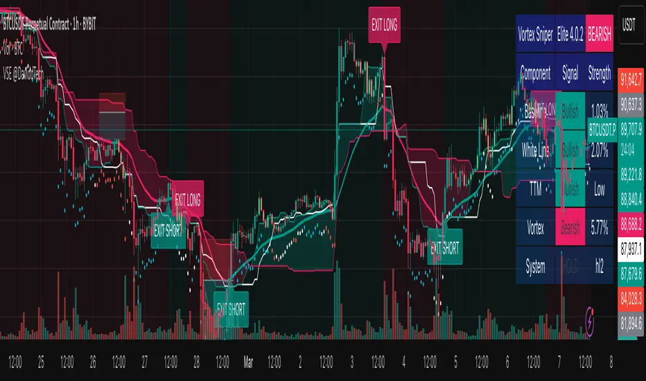
Vortex Sniper Elite @DaviddTechVortex Sniper Elite @DaviddTech
Vortex Sniper Elite @DaviddTech is a comprehensive trading system designed to deliver high-probability trade setups across all market conditions. By seamlessly integrating adaptive baseline detection, squeeze momentum analysis, and advanced vortex filtering, this indicator provides traders with a complete edge-based approach to market analysis.
🔥 Key Features:
Complete Model Integration:
Baseline: Advanced McGinley Dynamic indicator for superior trend detection
Confirmation #1: Enhanced TTM Squeeze for momentum and volatility analysis
Confirmation #2: Dual Tether Line system for dynamic market structure mapping
Volatility Filter: Specialized Vortex indicator for precision entry timing
Adaptive Stop Loss: Proprietary trailing stop system based on ATR calculations
Advanced Visual Dashboard:
Real-time component analysis with strength metrics
Color-coded signal status for immediate trade assessment
Squeeze state monitoring with visual confirmation
Vortex divergence strength percentage for optimal entries
Premium Signal Detection:
Multi-timeframe compatible system for scaling strategies
Automated buy/sell signals at optimal entry points
Clear exit signals for risk management
Squeeze momentum visualization for timing precision
DaviddTech Alpha Edge System:
Gradient transparency algorithm for visual trend strength confirmation
Bar coloring system based on momentum direction
Background highlighting for active signal states
Dashboard for ease of understanding
💰 Trading Applications:
Sniper Entries: Utilize the Vortex confirmation to pinpoint precise entry points
Trend Alignment: McGinley baseline establishes the primary market direction
Volatility Awareness: TTM Squeeze identifies optimal market conditions
Risk Management: Set stops based on the adaptive trailing stop system
Position Management: Monitor dashboard metrics for changing market conditions
Vortex Sniper Elite @DaviddTech represents the culmination of the DaviddTech methodology in one cohesive system. Whether you're a day trader seeking precise entries or a swing trader looking for significant market moves, this indicator delivers the structured approach needed to consistently extract profits from any market condition.
DaviddTech Trading System Explained:
The DaviddTech methodology follows a strict component-based approach:
The Baseline establishes the primary trend direction, acting as your first filter
Confirmation Indicators validate potential trade setups only when aligned with the baseline
The Volatility/Volume Indicator ensures you only enter trades with sufficient directional momentum
A Trailing Stop System provides mathematically optimized exit points
Vortex Sniper Elite integrates all these components into a visually intuitive system that eliminates guesswork and enforces disciplined trading decisions.
Recommended Settings:
This indicator comes pre-configured with optimized parameters, but feel free to adjust based on your timeframe:
For day trading: Reduce Baseline and TTM lengths by 30-40%
For swing trading: Consider increasing Tether and Trail Stop lengths by 25-50%
For scalping: Focus on Vortex confirmation with shorter timeframes
Best Practices:
Wait for all components to align before entering trades
Use the dashboard to evaluate the strength of each signal
Monitor squeeze states for potential volatility expansion
Let the trailing stop system handle your exits
Backtest across multiple timeframes to find your optimal settings
Simple Momentum Strategy Based on SMA, EMA and VolumeA simple, non short selling (long positions only, i.e. buy low and sell high) strategy. Strategy makes use of simple SMA, EMA and Volume indicators to attempt to enter the market at the most optimum time (i.e. when momentum and price are moving upwards). Optimum time is defined mainly by picking best timing for price moves higher based on upwards momentum.
This script is targeted / meant for an average/typical trader or investor. This is why a non short selling approach was selected for optimisation for this strategy because "typpical", "average" traders and investors usually use basic (i.e. minimum fees / free membership) exchanges that would not usually offer short selling functionality (at least without additional fees). The assumption used here is that only advanced and sophisticated traders and investors would pay for advanced trading platforms that enable short selling, have a risk appetite for short selling and thus use short selling as a strategy.
The results of the strategy are:
In an overall roughly bearish market (backward testing from beginning to end of 2018) i.e. the market immediately following the highs of around 20k USD per BTC, this strategy made a loss of £3231 USD on trades of a maximum of 1 BTC per long position.
But in an overall bullish market, it makes a profit of about $6800 USD from beginning of 2019 onwards by trading a maximum of 1 BTC per long position.
NOTE: All trading involves high risk. Most strategies use past performance and behaviour as indicators of future performance and that is not necessarily indicative of future results. Hypothetical or simulated performance results have certain inherent limitations too. One limitation is that unlike an actual performance record, simulated results do not represent actual trading and since the trades have not actually been executed, the results of those trades themselves do not have any influence on actual market results, which in real life they would have had (no matter how minor). Additionally, simulated results may have under or over-compensated for the impact, if any, of certain market factors, such as lack of liquidity. Simulated trading programs in general are also, by their nature, designed with the benefit of hindsight. No representation is being made that any account will or is likely to achieve profits or losses similar to those shown.

Opening Volume Scanner - Full AnalyticsOpening Volume Scanner - Full Analytics
A volume analysis tool designed to identify unusual opening volume patterns by comparing bar volume to average daily volume (ADV). The indicator colors candlesticks when volume exceeds specified thresholds during the first bars of the trading session.
Core Functionality:
Monitors volume as a percentage of ADV for the first N bars from session open (default: 5 bars)
Colors bars across 4 progressive threshold levels (default: 5%, 10%, 20%, 50% of ADV)
Calculates ADV using a customizable period (default: 20 days)
Optional bullish-only filter to display only green bars that meet volume criteria
Volume Metrics:
Bar % of ADV: Current bar volume expressed as percentage of average daily volume
RVOL (Relative Volume): Bar volume divided by ADV (e.g., 5.0x = 500% of ADV)
30-Min Cumulative: Sum of volume for first 30 bars expressed as % of ADV
$ Volume: Bar dollar volume in millions or billions
Display Features:
Customizable data table showing real-time metrics (position, size, colors adjustable)
Optional $ volume indicator with 9 symbol choices (triangle, arrow, circle, etc.)
Progressive color coding: yellow/orange/red for increasing volume intensity
Green color scale for RVOL and cumulative thresholds
Alert System:
RVOL alerts at configurable thresholds (default: 5x, 10x, 20x)
30-minute cumulative alerts at configurable % ADV levels (default: 100%, 150%, 200%)
All alerts can be toggled on/off independently
Customization Options:
All threshold levels and colors are adjustable
Table rows can be individually shown/hidden
Background transparency and border options
Compatible with all timeframes (designed for 1-minute charts)
Use Case:
Identifies stocks experiencing unusual opening volume activity relative to their normal trading patterns. Useful for momentum traders looking for early signs of institutional activity or catalyst-driven moves in the first minutes of the session.

Session Volume AveragesSession Volume Averages
Overview
Session Volume Averages is a session-aware volume indicator that combines live volume with historical session context. It displays current volume as bars and overlays two analytical reference lines for each enabled session.
Session Average — the average volume-per-bar across the last N completed sessions.
Bar-Position Average — the average volume at the same bar position within the session (time-of-day average) across the last N completed sessions.
Up to three independent sessions can be enabled simultaneously (default: New York, London, Tokyo), each with custom hours and colors. When no enabled session is active, the pane remains clean.
---
How to Use
Add the indicator
Apply Session Volume Averages to any symbol and timeframe that provides volume data.
Set the time zone
The selected time zone is used for all session window calculations.
Configure sessions
Enable or disable Session 1, Session 2, and Session 3
Set custom trading hours for each session
Choose a color (used for both average lines)
Set the sample size
Choose how many completed sessions (5–100) are used to calculate the averages.
Read the chart
Histogram bars show current volume (only while a session is active)
Thick line shows the session-wide average volume-per-bar
Thin line shows the typical volume for the current bar’s position within the session
---
How to Interpret
Current volume above the Bar-Position Average means volume is elevated for this specific time within the session.
Current volume above the Session Average means volume is strong relative to the session’s overall baseline.
The shape of the Bar-Position Average highlights where volume typically concentrates (opens, overlaps, closes).
---
Optional Debug Mode
When enabled, a small table displays live diagnostic values, including current session averages, bar-position averages, and the current bar index within each session.
